
2015 Sep - 2016 Mar
Me & Supervisor & PhD
Individual project

During the course of the two semesters, I came up with two robotic design proposals; Mainly exploratory, the projects blended physical and digital realms, with an early practice of market analysis and business proposal. This article mainly explained factually what has been done and learned along the process.
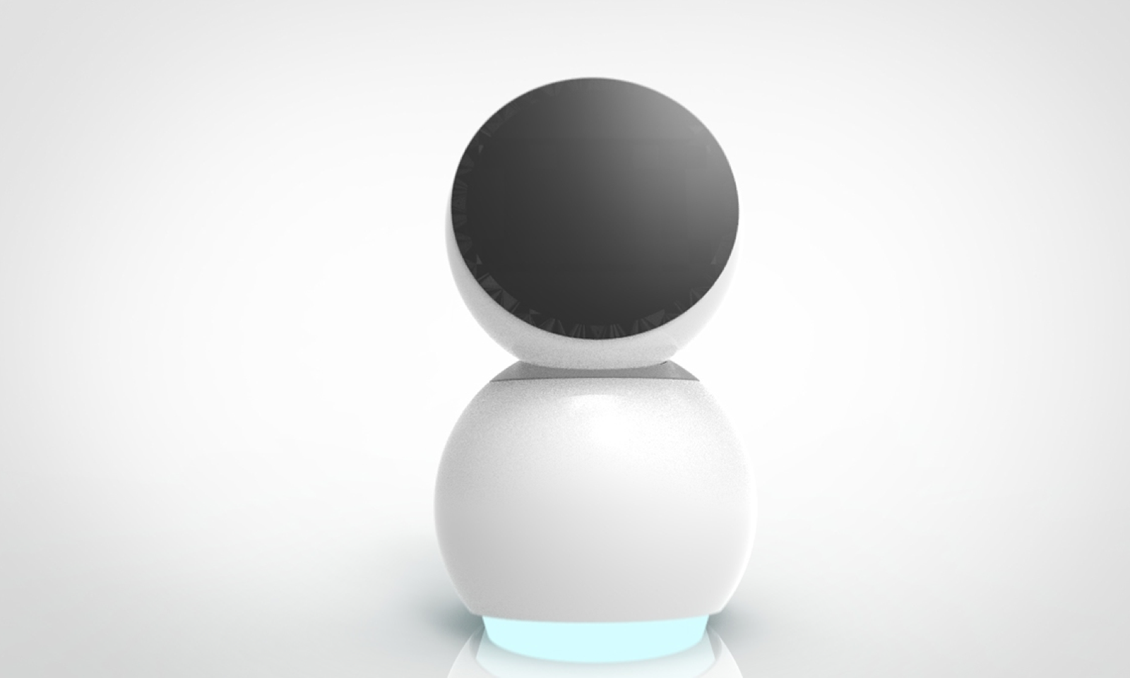
The name “Babble” is chosen, as the word is a replication of gentle and pleasant sound of water. It also indicates a kind and calm person. Moreover, Babble is similar to Bubble, a metaphorical vocal expression to the shape of the robot. It was later on discovered that "babble" in Dutch means talk or chatter, reflecting its learnbot nature.
Babble is an interactive learn bot designed for children & teenagers. It is a project that combines consideration of Form + Shape, Animation rules which is applied to mechanical movements and expressions, as well as the market potential analysis.
The four major segments listed on the diagram beflow resembles four of the most important segments while performing social interactive robot design, incluing Architecture, Human-Robot Interaction (HRI), Cognition & Perception, as well as Action. Above all factors, there is design and morphology, directly linked to the most intuitive interpretative impressions.
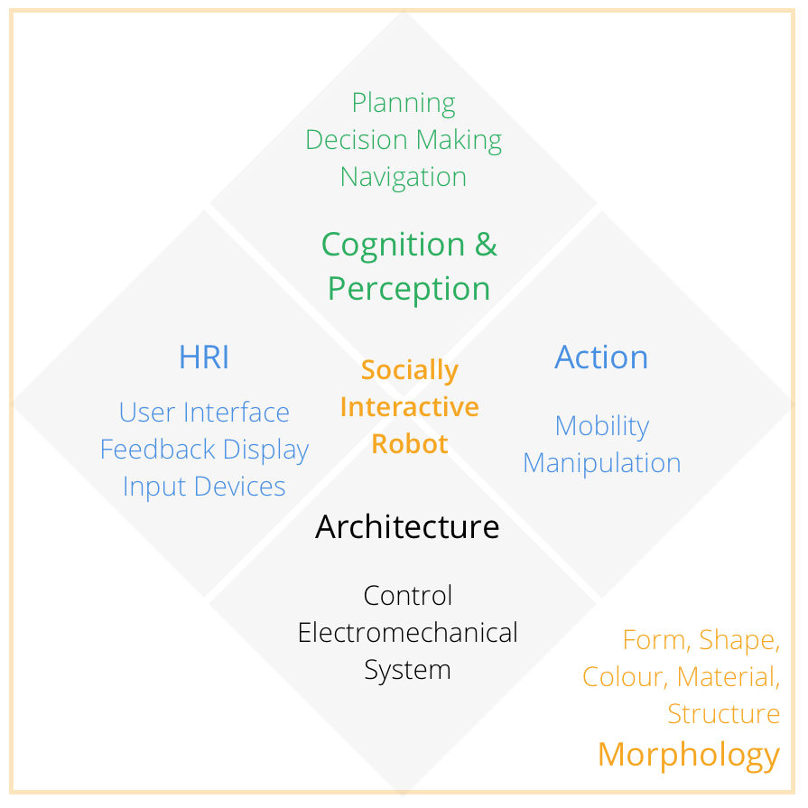
Among the factors described above, more attention are given to action,
human-robot interaction as well as architecture control of the robot.
A. “Human-oriented perception” by interpreting
human activities and identifying human feedback;
B. “Natural human-robot
interaction” which addresses normal social responses of dialogues or actions;
C.“Readable social cues” that could reflect its own internal statues back to the user
through expressions, gestures or words; D. “Real time performance” to provide users
with timely responses (Fong et al, 2003).
Two major functionality for the product are
identified as motion and display, as both would assist design considerations for the
level of interactivity.
Design thinking should be taken into consideration during various stages of product development, including product functionality, apparel, interactive experiences, its emotional resonances as well as social factors. Product morphology includes designing of its form, shape, colour, materials etc. Though the robot’s morphology is suggested to be necessarily inline with its functionalities (Fong et al, 2003), the two factors co-contribute to the user’s interactive experiences; upon which the emotional values as well as social factors are revealed.
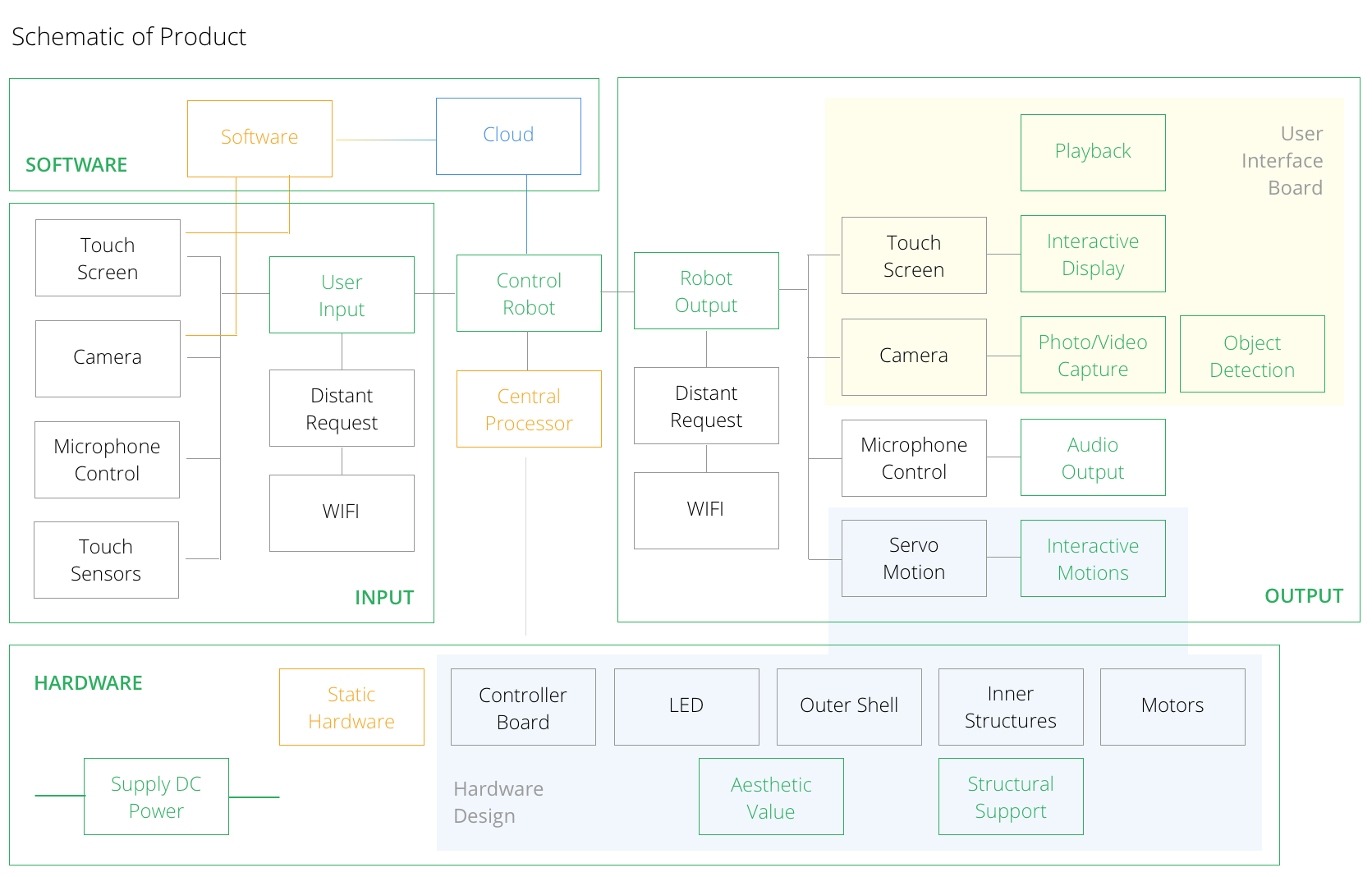
As seen from the figure above, the system could be divided to four main segments. From physical aspect, it could be divided to hardware and software sections, where hardware includes part that is static (“Hardware”) as well as parts that are functional (“Input” and “Output”). Green boxes in the diagram indicates the functions performable by the parts they are linked to; blue-broader box indicates the Cloud server that hosts and connects all user’s non-sensitive information. Interactive design is reflected from two segments of the robot — the user interface board, mainly consists of a touch screen and camera; the hardware designs, where static industrial design, mechanical design and dynamic motion planning comes in.
A steady servo (MG995) attached to a rotatory base in combination of two more
servo motors were chosen to construct the robot inner skeleton (Appendix B:
Prototypes). Selection was mainly based on resources available for faster prototype
construction. This allows Babble to have three degrees of freedom: rotation of the
entire body; rotation of its head in two directions, allowing it to nod and wave. It has
a screen in replacement of a physical face.
Base & Servo #0.
This is the base servo, the motor for the entire body rotation. Origin of the ground
coordinate rests on plane 0, located at the robot base center. Direction of axes are
the same as the coordinate directions for servo #0. Rotation axis for servo #0 is Z-
axis, as such, it does not need to overcome external torque imposed by gravity at
any position. Thus, there is small load requirement for servo #0.
The base where Servo #0 is attached to has a stable structure; it has a for-legged
support that assembles three metallic plates at the same time. One of the plates
mounts servo #0.
Body & Servo #1.
Servo #1 accommodates the nodding motion of the robot head, which also
encounters the problem of excessive loading. The rotational axis for servo #1 is in
plane 1, the XY-plane of servo #0. Little deflection of the servo arm results in
significant loading on servo #1. Gravitational force accounts for the largest portion of
the external torque. This directly affect the servo performance, namely, the robot
falls over upon sudden changes of motion or electrifying; the structure could not
stand straight if the weight above servo #1 is unbalanced. Though the problem is
resolvable through changing servo #1 to one with larger torque inertia, the
replacement is hard to accomplish in this case, as the entire base section was pre-
assembled such that the structure is only suitable for the size of this type of motor.
Head & Servo #2.
Servo #2 extends interactivity to a larger scale. The robot head could now sway left
to right. The rotational axis is orthogonal to the screen. With servo #2, the robot
head now has full rotational capability installed. By default, the position of the robot
head has 25 degrees of extension, as shown in the figure above. This is under the
consideration that for most of the interaction, the user’s eye sight comes from a level
above the robot head, an extension would allow the users to view the screens easily.
Controller Board & Battery
The controller board available for usage was pcDuino v2 board. This is similar to a
personal-computer, where programs and commands can be loaded to perform
desired operations. The operating system running on the pcDuino was Ubuntu 12.1
by default. In order to support the software requirement by the learning framework,
it was updated to Ubuntu 14.1. The pcDuino has a small dimension of 10.5cm by
5.3cm, easily to be incorporated to the existing robot structure.
The controller board, as well as battery component are most likely to be
incorporated to the base shell segment of the robot. The space between robot base
to the base of servo #0 is currently designed to be filled with plastic translucent
material, both for decoration and supporting purposes. Rechargeable battery could
be incorporated within the base structure as an extra weight for stability, and the
controller board could be secured on top of the battery.
Screen
The screen was selected as a 7’’ Capacitive touch screen (RobotShop, 2016) to allow
touch input from the users. (Appendix C: Babble Prototype) However, due to the
limitations of no existing driver available for enabling touch function on pcDuino, the
previously designed touch interactivity is achieved through reading user’s input from
the keyboard and respond accordingly.
The back of the screen is assembled to servo #2 through a single servo, due to the
unavailability of servo connectors. However, the structure is not steady. Thus, a
supporting “I” frame is proposed to be attached to the bottom of the screen.
Subsequently, the screen and the frame is assembled to the head shell through
small screws and a circular ring frame, and to be further enclosed with organic
glasses mounted to the top of its surface (Figure 3.3a).
Camera Module
Another component not included in the drawing is the camera module. However, it
has been incorporated during the testing stage. As seen from figure 3.3 above, there
is a cavity above servo #2 behind the screen frame in its head compartment. This is
where the camera as well as controller boards for the camera and the screen will be
inserted. The plan for the next step is to fill in the cavity with a proper sized and good
quality camera module.
The servos are controllable in two ways — through a motor control program or
through sending in discrete line commands. While testing through the motor control
program, dragging the pointer position could change the rotation of the servo
motors respectively.
A set of actions were determined for the robot through this
program. Actions including “casual looking”, “smile/happy”, “nodding”, “look left” and
“look right” etc. were incorporated.
In order for the motors to rotate while connected to pcDuino, line command is
needed for motion control. The format for a line command is:
#0P1500T1000 /r/n
The respective position of each servo at robot initial position:
Servo #0: P 1500 Servo #1: P 1130 Servo #2: P1580
If the desired action is a nodding action:
//Initial position #1 at P1130
#1P1280T1000 /r/n
#1P1050T1000 /r/n
#1P1130T1000 /r/n
This could be easily interpreted. Range of action for for nodding action is to control
servo #1 from P1050 to P1280. Starting from its initial position, servo #1 would go
up 150 steps to P1280 in 1s, then move downward to P1050 in 1s, then return to its
initial position in 1s.
To list an example for a more complicated smiling action:
//Starting from Initial position
#0P1600T700
#1P1080T700
#2P1700T700 /r/n
//Moved to designated position in 0.7s
#0P1600T700
#1P1080T700
#2P1700T700 /r/n
//Pause at designated postion for 0.7s
#0P1500T500
#1P1130T500
#2P1580T500 /r/n
//Return to initial position in 0.5s
Do notice that “/r/n” only occurred after sending in command for all three servos.
The commands for multiple servos are interpreted by the controller as one whole
command, which could be processed at the same time. The replication of code from
the first to the second command block segment is because the action requires the
robot to pause at the designated position for a while, in order to make the effect
more realistic. There the pause, robot is returned to initial position.
Peer interaction between robot and human requires certain level of “humanness” in the robot (Fong et al, 2003). As mentioned in section 1.4.2, facial expression is adopted by many designers to reify the product experience. The installed screen could serve as the face of the robot, and facial expressions plays an important role in designing the interactivity.
Animate CC by Adobe is
capable of creating 2D animation, and interactively programmed and controlled
through JavaScript. The application was priorly know as Flash. The current version is
updated with Web Graphics Library (WebGL) and HTML5 export compatibility.
Though unable to create 3D models, it could add gradient to shapes instead to
create depth to the animation. The biggest advantage of adopting Animate CC is its
broad compatibility across browsers.
Expressions are designed and programmed in Animate CC. The expression
animations are edited by adding key frames on the timeline. Animation sequences
are transit and controlled by Javascript languages and pre-defined libraries. As touch
function is disabled for the capacitive screen, keyboard is used as an input to trigger
its animation responses. For example, if letter “a” is detected on keyboard,
//a=angry
if(e.keyCode===97)
{
this.gotoAndPlay("angry");
}
the system would go and play “Angry” sequence of the animation.
97 is the keyCode
for letter ‘a’ on MacOS keyboard. This commands the timer to go to the keyframe
assigned by name “angry”. In our animation sequence, keyframe 55 is assigned as
“angry”.
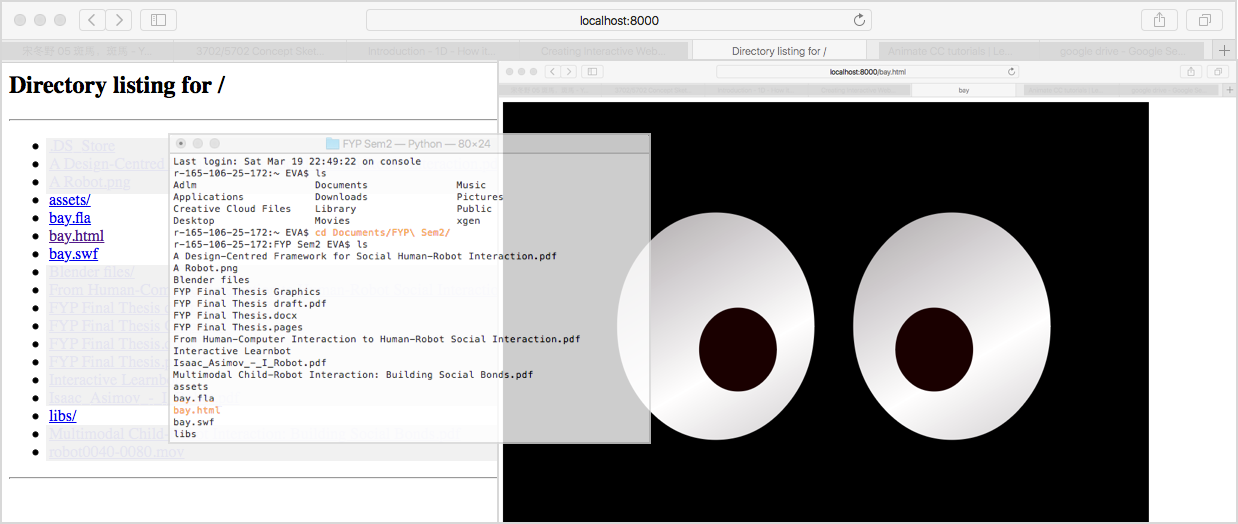
Frame 0 is assigned as “idle” in our program. If letter “a” is pressed on the keyboard,
the animation will jump to keyframe 55 and start playing “angry” sequence. The
sequence ends at frame 106.
Frame 106 has a command of
this.gotoAndPlay("idle");
such that once the timer reaches frame 106, it will read the command and return to
play “idle” sequence starting from frame 0. “idle” is designated as blinking motion at
static status. If no action is triggered, the system will play idle sequence in a loop.
Heavily inspired by JiBO & the simplicity of its shape and the minimum yet highly complex degree of movements, after going through a few rounds of iterations, babble landed on a shape that combines the inspiration of JIBO,
the Chinese panda & a traditional Chinese "Wawa", giving it a more huggable shape & form.
Babble is
designed with fluid curves, major geometrical shapes includes a sphere and an
spherified cone as its body. Its bottom is decorated with LED. Neck of the robot is
decorated with a piece of dully shiny metal that could be interpreted as a collar, at
the same time distinguishes the body from its head.
Now looking at babble again, it also reminds me of BB-8, as well as a little snowman.
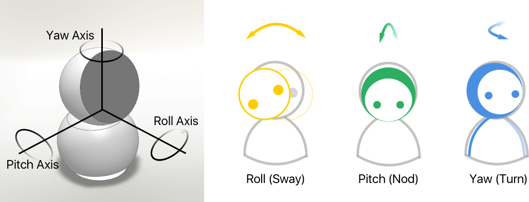
Main body compartment of the robot is driven by servo #0 along with its head. Head of the robot is also controlled by servo #1 and #2. With reference to ground axis, the head of the robot could perform roll (sway), pitch (nod) and yaw (turn) motion (the whole body moves along servo #0 for yaw motion).
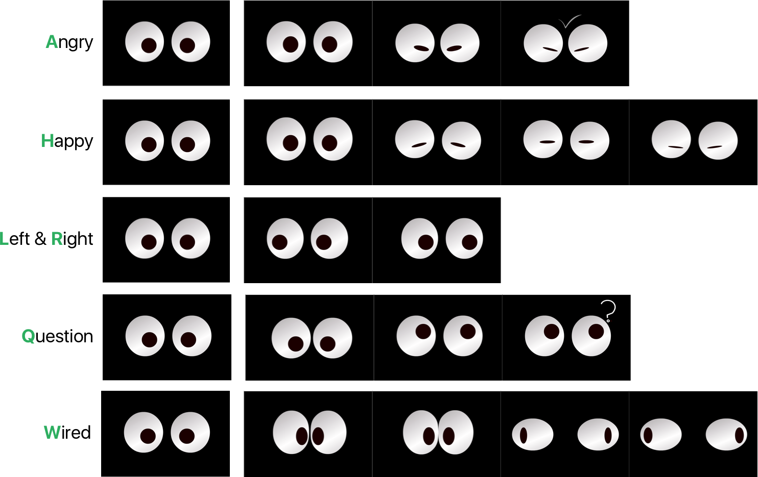
The expression is explained by screenshots of keyframes. Principle of disney’s
animation rules were also implemented here for a more realistic effect (Stanchfield,
2009), most typically reflected in expression “Happy” and “Wired”.
As seen from the illustration above, the figures are elastic and vivid. “Wired” is
designed to express a feeling of awkward or surprise, or when there are too many
things to learn that it is unable to handle. As the eye-bulbs approaches each other
very rapidly, they look like sticking together, being squeezed and bouncing back to
the side again.
The “Happy” expression is also interesting. As seen from above, isolating the last two
thumbnails may lead to an impression of arrogant or angry. However, while playing
in a smoothed sequence, the expression looks lovely and projects a satisfying smile.
Thus, it is significant to view the expression sequence as a whole instead of isolating
any key frame and look at them individually.
The choice of material closely affects the user’s responses on the product. As an
example, shiny surface of plastic (ABS) material correspond to cheerful and modern
outlook compared to those of a dull surface. However, researches have found that
smooth plastic surfaces is correspondence to slippery perceptions, a feeling of
sickness (slightly), coldness and easily contaminated with dirt or sweat. (Zuo, H, Jones,
M and Hope, T, 2005). Thus, material selection rely on feedback from customers for
more accurate choices.
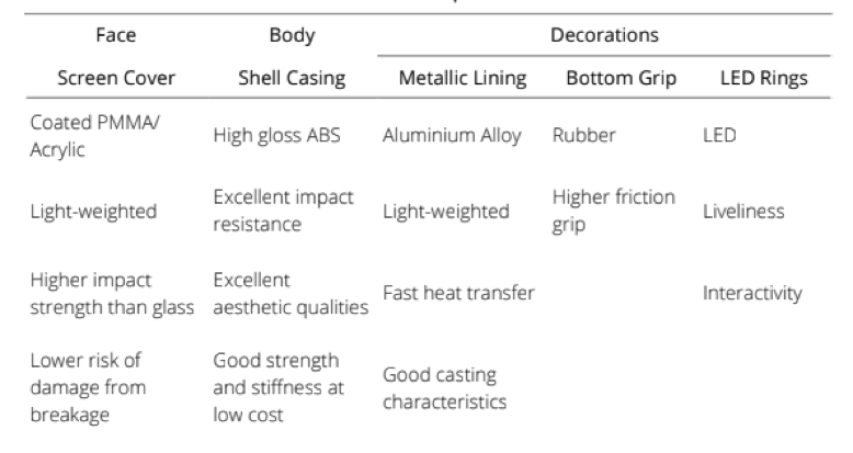
The face of the robot will be covered with acrylic. The material has similar display as glasses, yet lighter in weight and higher impact resistant. Breakage of such material is unlikely to produce much fragments as when glass breaks, such that it is safer under such extreme circumstances.
The product is aimed for children who has less developed knowledge base. Target
users have age range of 5 to 11. The product should be able to meet the users’
requirement. From the data of World Health Organization, girls from this age range
have a height of 109 - 145cm, and boys from 110 - 143cm on average (WHO, 2016).
An estimation of 45 - 60 cm of arm length is estimated for age
group of 5 - 11, correlates with the data from TUDelft.
These data matters with the design of the robot especially when it comes to human-
robot interaction. Overall, the robot is 40.8 cm in height. At its natural position, the
screen surface is 65 degrees to horizontal plane, and center of the screen is 29.8 cm
above robot base.
At standing position, the child height
ranges from 110cm to 145cm, desk height ranges from 55~65 cm for children of this
age, and 65~75 cm for adults. The optimum angle for a single view position ranges
from 10 degree above standard line of sight in the horizontal direction, as well as 45
degree below (MIT, 2011).

The product should link
closely with the customers needs and preferences, as well as analysing them in a
forecasting fashion instead of pure observing the customer behaviours. At the same
time, as the field of investigation for user experiences is relatively new, it is would be
reasonable to consider the following the trends in the market, in order to better
positioning the customers need as well as collecting feedbacks from the existing
products in the market.
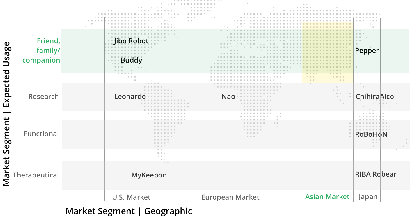
From a general statistical evaluation, buyers are mostly
identified to be working adults from 30 to 40 with relative higher affordability. The
interest group spans from 25 to 40, and higher percentage of both buyers and
interest groups are male.
When the research was done in 2015,
depression was predicted to be the
second major cause to disability by
2020 (which is now!). Based on an
early article by WHO this year, suicide
is the second leading cause of death
in 15-29-year olds. A category of
depression, social anxiety disorder
(DSM-5), typically occurs among
adolescents between 13-18. Similar
symptoms may also occur in children
mainly from 3-6, categorised as
selective mutism. The symptoms
include difficulty in interpersonal
communications, impaired social skills
and fear of public speaking. However,
these remain highly unidentified among
many young people, as the symptoms
could also be interpreted as shyness,
and these children could behave
normally at home.
Prevention programs and interventions
have shown to be useful to reduce
depression.
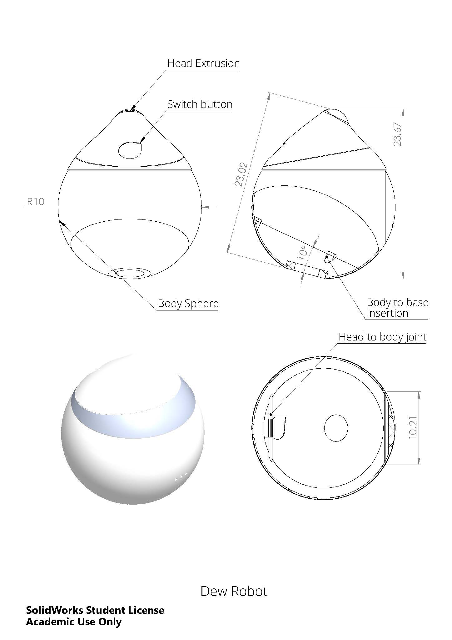
Dew is a robot developed specifically for these group of young people, though it
could also be used for people enduring mild depression. It is not a cure or therapy,
but rather an emotional companion or support, to assist the emotional regulations
of the users. Major focus of the design is to empower the emotional communication
with the users.
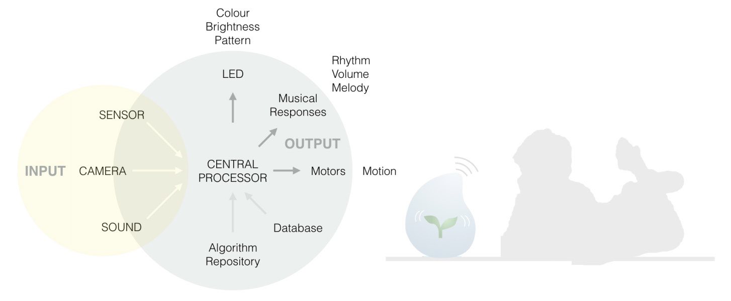
Major input from the user comes from two dimensions: touch and camera-capture. Through the sensors embedded in the robot skin, touches from user will be analysed for their interaction mode and emotional status, whereas motion and user expressions are captured through the installed cameras. Output of the robot includes conducting photo/videography, giving musical responses, expressing of emotional states through LED changes as well as responding through motional changes. The I/O conversion is achievable through the hardware installed inside the robot, which includes various sensors, cameras, microphone, LED lights as well as motors to enable its motion.
Structurally, Dew includes two major compartments – physical motion system and
interactive I/O system. Motion system is where physical movement determines
responses and interactions. Both its body and top-cap are capable of rotation. Dew
is able to track and follow position of users through changes in its orientations. The
mobility is achieved through two servomotors, one installed at the base that controls
body-motion, the other at the body-cap intersection to control rotation of its tip.
The interactive I/O system is where other functionalities are processed. Input
system includes two stereo cameras as well as various sensors distributed
throughout the robot body. Output system includes LED headlight, LED lining as
battery status indicator, as well as LED interior for expressional responses;
microphone for audio responses; motion also assists in expressing its responses. To
ensure the output responses are emotional, Dew would be incorporated with a
software engine that is able to analyse user’s expression and gestures, process the
data from sensors and cameras simultaneously, and give a correspondent response
through the musical, motional and expressional reactions.
Two main types of sensors are incorporated, including
positional and bio- sensors. Position sensors calculates how the user interacts
through changes in Dew’s relative position. More accurate data could be generated
by combing the input captured through the camera. Bio-sensors include
temperature, skin conductivity (SC) and blood volume pulses (BVP) sensors.
Researches have found that unimodal sensors is not accurate in detecting emotion-
related variations because the result varies among individuals and the would
fluctuate on a single person with one modality (Kim, 2007). This is the reason why
multiple sensors should be adopted.
Sensors are chosen based on relative effectiveness and accessibility. As the most
common body area the users would use to interact is their hands; data obtainable
from hands is primarily considered. Moreover, SC is commented as the most
effective measure of emotional-physiological relationship. Temperature, heart rate
and pressure are also directly related especially with high arousal of users’ emotional
states (Wagner, Kim, Andre , 2005 ́ ). Hot spots for user input is proposed as top tip
and near-bottom body area. sensors will be mainly implemented in these areas.
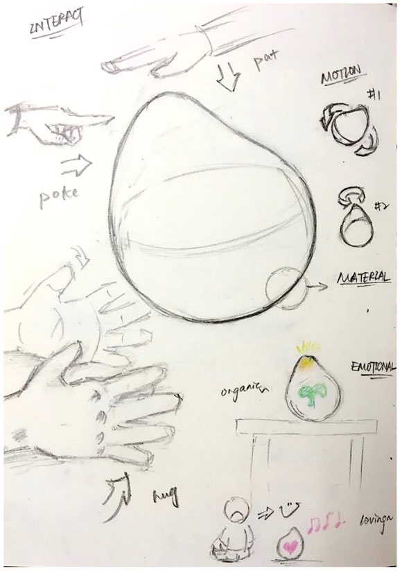
What would be significant for the users, is the look of the robot (visceral); what the robot do, how does the robot interact and communicate with users (behavioural); and finally, do they want to maintain the long term relationship with their robot (reflective). The shape and materials of Dew are the first factor in emotional responses. Cameras, microphone and sensors are to be embedded into Dew to collect the input and bio-signals from the users. Furthermore, there’re multiple modes of interaction with Dew, such as light (visual), music (sound), movement (motor) and touch (sensual).
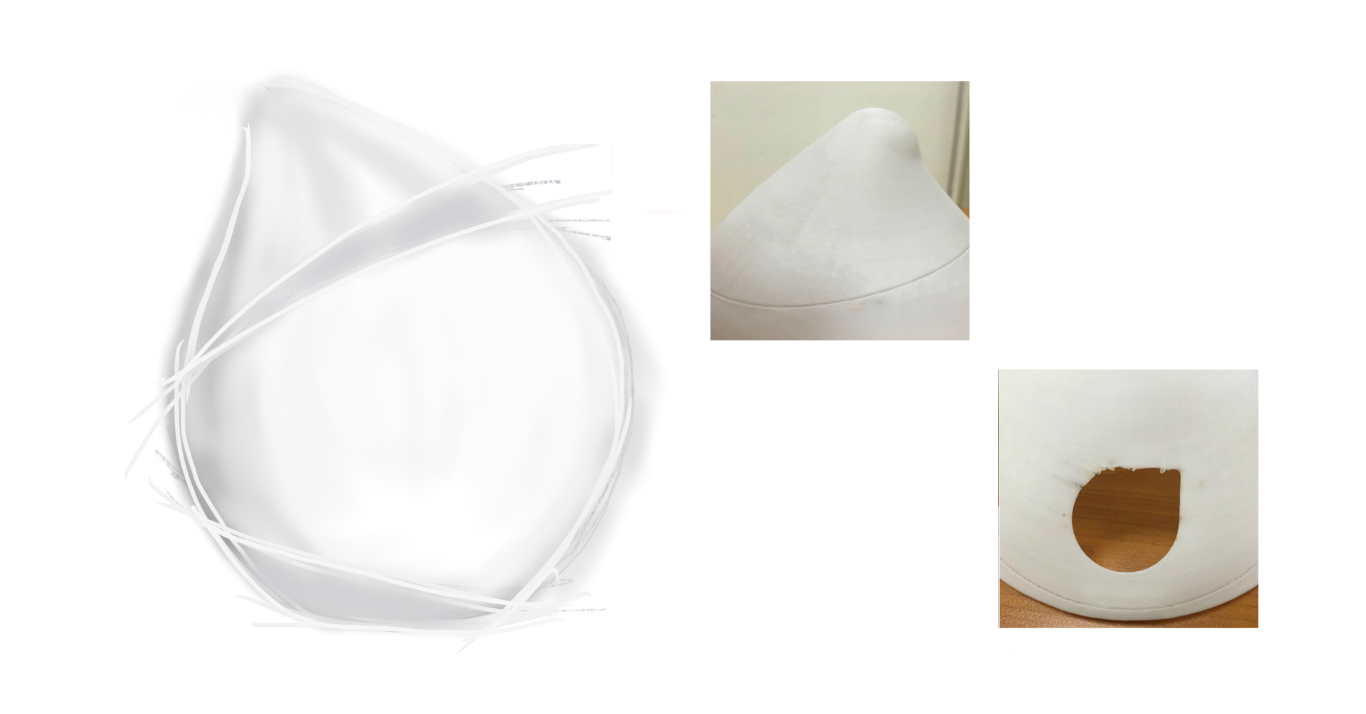
Among all geometric shapes, a dot (sphere) is the simplest and most symmetric shape. Dew is designed with a tweak on this shape, with its head-tip as a small and smooth extrusion, to break away from the perfect symmetry, and give a further trigger of sensation. The shape partially originated from an imaginary cartoon figure of a lively and amiable red-hat boy, who is always looking around at its surroundings. The tip of the shape has its inspiration from water droplets, plant buds as well as morning dew, objects that indicates liveliness, health, energy and happiness. The smooth and floating outlook welcomes people to touch and interact. It feels soft and tender, conveyed through both the form of its outlook as well as choices of materials. One proposal for the material is translucent low density polyethylene covered with translucent silicone, allowing light to pass through, also gives a tender and warm touch to the outer layer, allows it easy to hold on to.
Things to improve:
After concept generalisation and testing for this project,
improvement could be made on design process sequence and
efficiency. The process focused too much on the form instead of
mechanical structures in the starting stage, leading to problems
of hardware incorporation.
It should be noted to design for the whole product and focus on
entirety before narrowing down to details and specifications. As
an example, while focusing too much on each separate
segments inside Dew, the dimension of the whole structure was
not as good as if the whole structure was taken account for in
the first step. Subsequent parts and pieces would need to be
designed based on the previous parts, which lead to
complications for design in later stages as well.
As for the process of prototyping, especially when it is necessary
to use time-consuming methods such as 3D printing, a better
approach would be to have a rough prototype to test for the
product dimension before moving on to production. This is to
ensure that the dimension is suitable and desirable, at the same
time save significant time by producing a less iteration-required
model.
Gained:
I've gained invaluable knowledge for emotional design, interaction design and product design;
the project allowed me the time and opportunity to learn about the principles and different disciplines of design, and allowed me the freedom to explore;
It has also helped me towards the career transitioning from engineering to design.
The full report, along with citation & references, thourough market & competitive analysis etc. can be found here
Published and presented Design and Development of Dew: An Emotional Social-Interactive Robot on the 8th International Conference, ICSR 2016, Kansas City