
2020 Mar till now
Cross-chapter collaborations
Lead designer

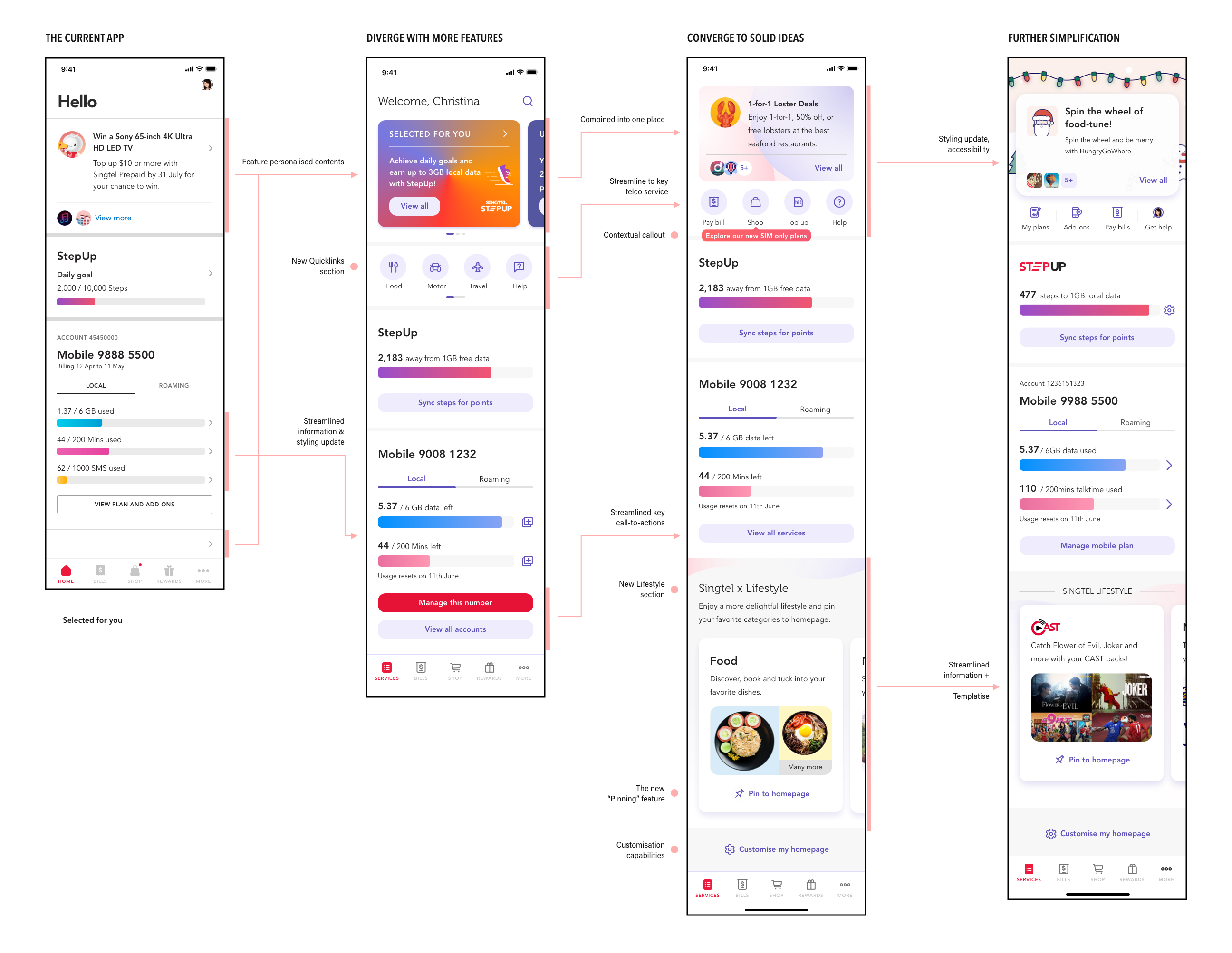

To support the service transformation from telco-focused to lifestyle oriented, as well as addressing the existing gaps in customer experiences. We decided to start from revamping the homepage, and increase the exposure of the new lifestyle services.
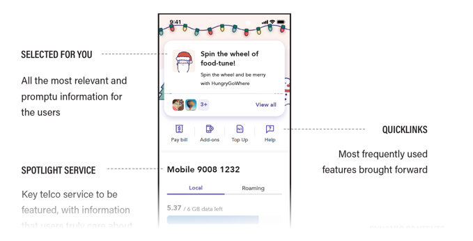
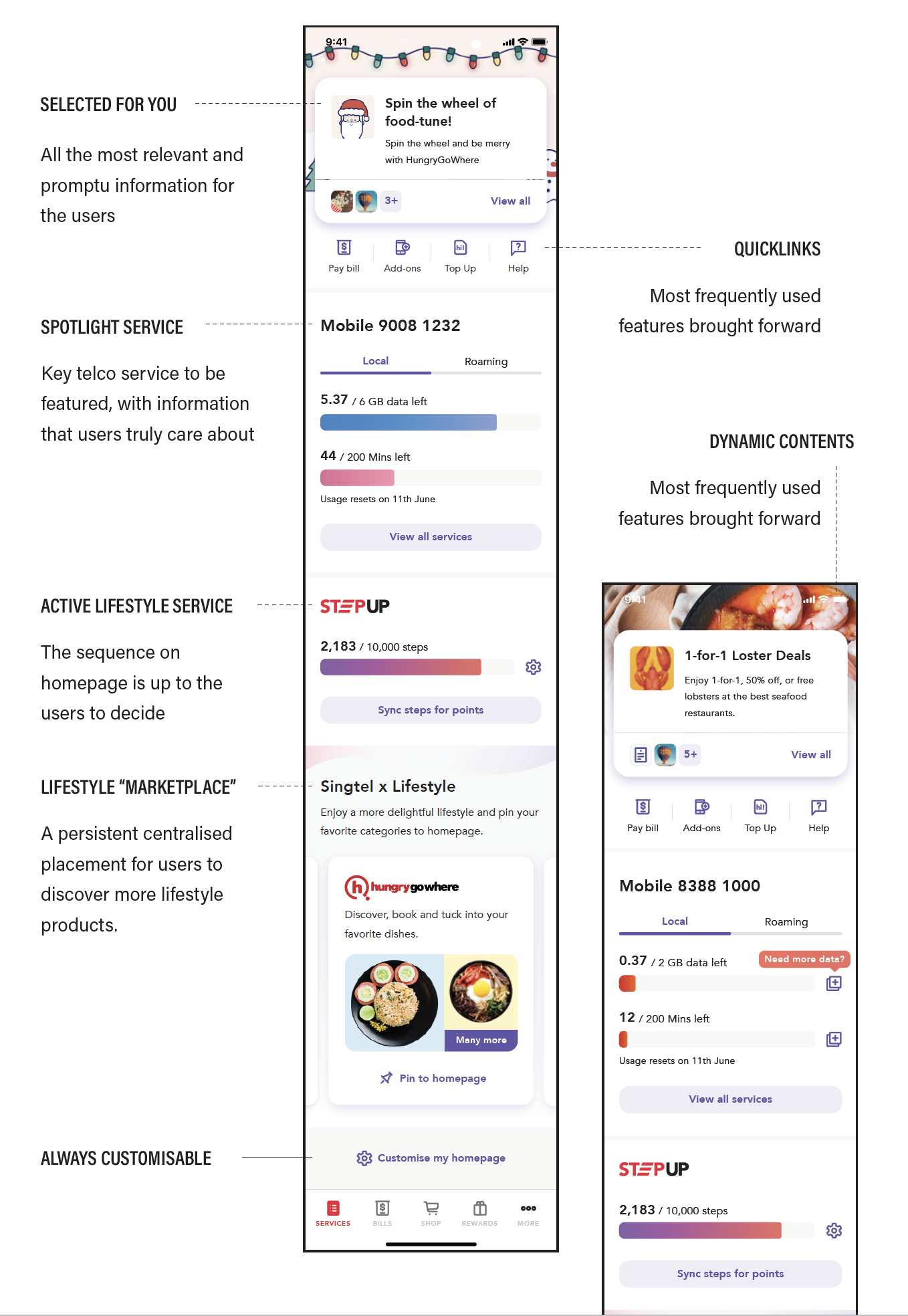
The platform was not designed to be sustainable. It was designed for a certain amount of features without considering the potential addition of information. With the further addition, the system became "patched" instead of "refined", started to lose the hierachy and became difficult to navigate for the users.
Service transformation
New service awareness
Engagements
Usable & discoverable
Personalisation
Design language system
Loading
API calls
Resuable & modular
Hence, we consolidated the requirements, problems or objectives from all three main departments and combined into the table above as the MVP tackle points
The first concept test (as seen on landing of this page) is made based on prior UT findings, app store complains, customer feedbacks etc. We used this prototype in a full one-hour concept testing session with 5 participants, remotely. The key concepts in this version includes having a carousel approach of intergrated "updates" sections on top, as well as a carousel of quick actions, some of which link to the new lifestyle services. Here're some of the findings highlights -
With the additional findings from the concept test, as well as some preliminary understanding of technical contraints with timeline, I made some further iterations to the prototype.
- streamlined content on top section for MVP
- simplified the list of quicklinks for users
- persistent discovery section at page bottom for lifestyle services discovery
- easy onboarding for users
Similar to the concept test, we did a full hour usability test with 5 other participants with the iterated prototype. The discoverability of new services increased, and there were more clarity towards the quicklink actions.
In the further iterations, I focused more efforts on iterating & testing specific features such as onboarding, the all-in-one updates section and details page navigation patterns.
- comparing two different onboarding approaches and test how intuitive each option is
- incorporate service notifications, and test the dynamic logic
- new minor addition on the details page top navigation pattern
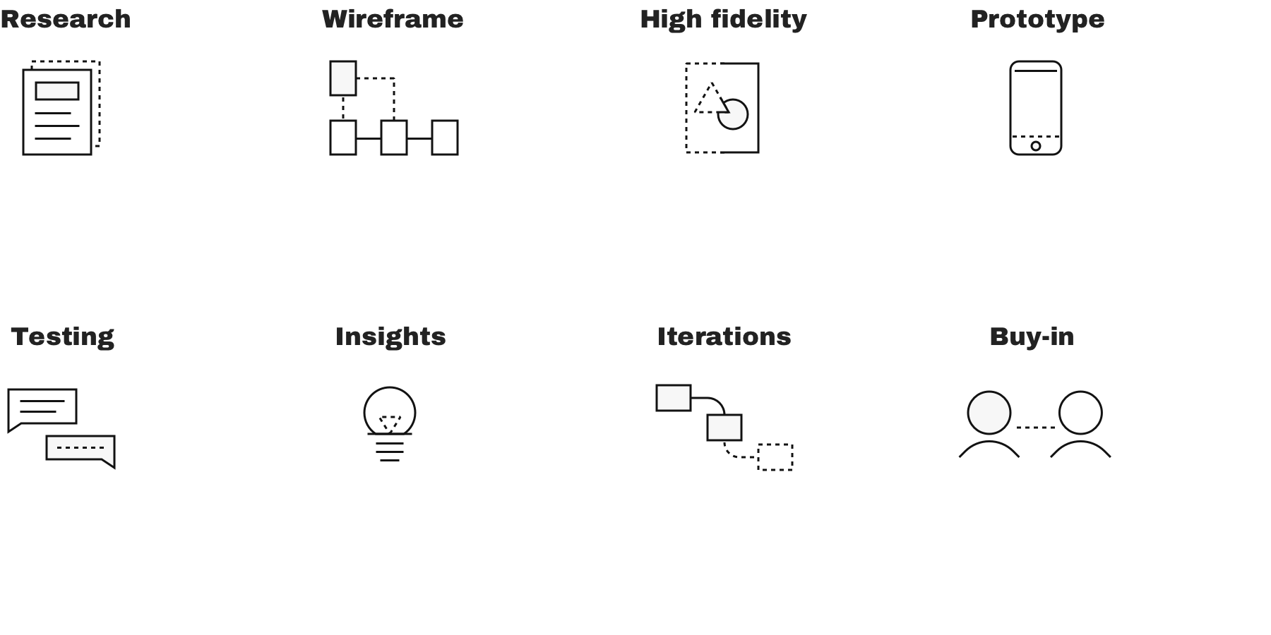
At the moment of writing (early Apr, 2021), this project is in the midst of grooming & development. The first usability test stared in March 2020, this project softly started in May and has gone through 5 rounds of full UT & agile tests. We're planning for this project to launch by Q4 this FY, or early Q1 in FY21. The design process was really agile and responsive to changes, I was able to make quick iterations and quickly get the concepts tested.
One of the important aspect where design & development are intertwined, is the scalability considerations. We used the analogy of a "Shopping mall" as an internal reference, to illustrate how the different product squads collaborate & contribute to the platform that functions as a "mall".
Although most of the work mainly evolved one key screen, the project was a close collaboration with multiple teams in my company, including my squad on My Singtel app, the Lifestyle Service chapter and the Design Language System chapter. And thanks to the support of my manager, director and POs, we were able to get the stakeholders' buy-in quickly and moved the pieces forward rapidly enough.
The full executive report can be found here
Despite the long time-span, this is one of a few main projects that I was the main designer during the first year in Singtel. Another key project will launch on 11th Dec, 2020, it is the Multi-factor authentication on My Singtel app.
As one of the first independently led projects that impacts a broad range of users, this project has seen through many decision-making and prioritisation moments. I had to make hard calls and prioritise the MVP features based on testing data, and prepare the opportunity & benefits analysis to get buy-in from various stakeholders. This project was agile, iterative, data-driven, with research highly integrated into the process.
Stakeholder meetings are not the easiest to manage - the higher rank the other parties are, the lesser patience and time they have to offer. It is critical to highlight the key points, backed up with solid proof and data, and communicate the ideas through quickly.
There’s no endpoint to any sort of perfectionism - we designers of all people should know that very well. Pixel perfect is not the most efficient way to move a project forward. It is critical to know when to push for fine details, and when to look at the overall strategy.
Working in agile means many things - although it may sounds “fast”, the backlog constantly evolve. Initially planned for Q3 FY20, the project was delayed till Q1 FY21. What we can do, is to quickly respond to changes, and prepare the necessary details till the time comes.
This is one of the most recent learnings I've had. The organisation was undergoing some re-org recently, and the initial business owner of the project changed as a result of the restructuring.
Although this does not impact the squad directly, there're changes in terms of budget allocation & roadmap planning. Instead of a consolidated centralised budget of development, the project is
most likely being compartmentalised into key features, and get funded via the various stakeholders who benefit from the respective features.
This process is relatively new to me.
It was shared to me by the new PO of the squad, something that influences the business prioritisations, and hence the MVP customer journeys to some extend.
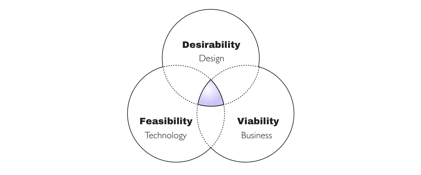
To me, it is critical for designers to get involved in such processes, stay on top of the product development progress, and being able to pivot and respond quickly to fit the need of the golden trio.
Last updated on 03 May 2021