After being driven by the requirements for so long, we had a regroup within the design team to identify the most pressing needs of our customers. Our insights narrowed down to 6 mighty pots, "Someone help me" became one of them.
2018 June - 2019 June
2 designers, 1 producer
Lead UX & UI designer
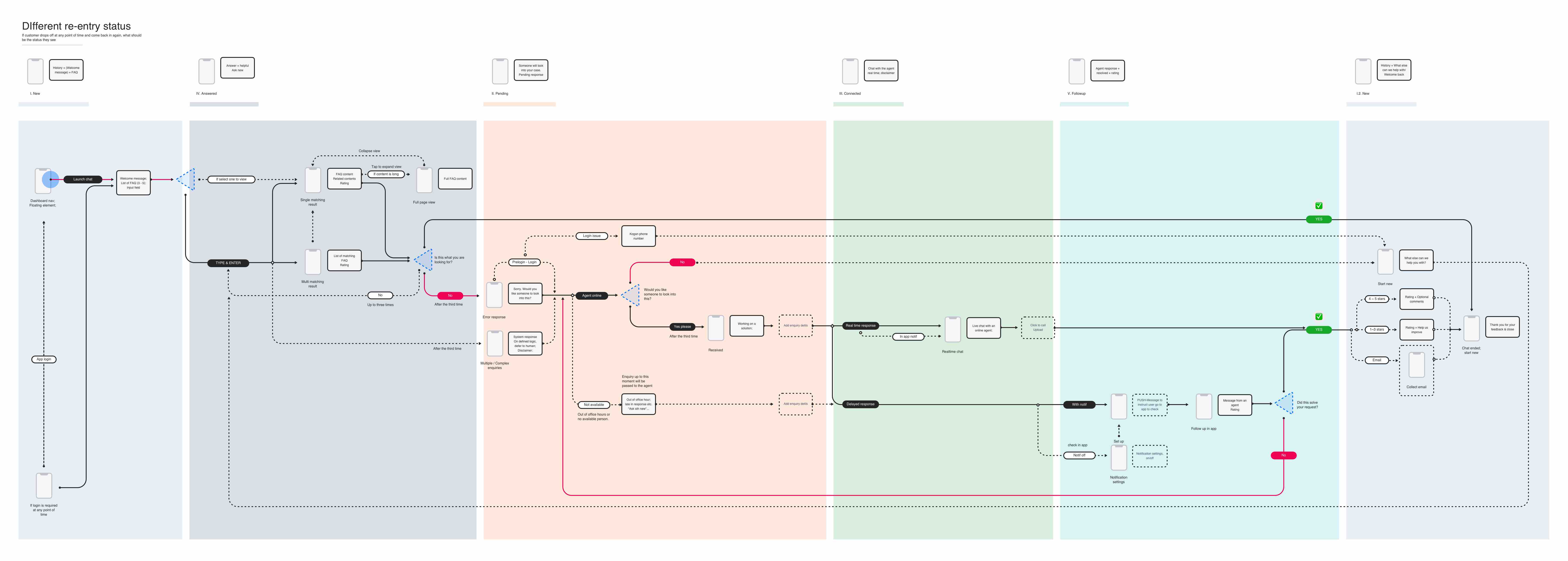
After being driven by the requirements for so long, we had a regroup within the design team to identify the most pressing needs of our customers. Our insights narrowed down to 6 mighty pots, "Someone help me" became one of them.
Unlike the day to day banking features, this topic was fairly new and yet to be defined. We need to make sure that there's a "North star" direction that is aligned with the customers' needs and business objectives. Our Northstar is to create a seamless banking service experience, breaking down the silos between different channels (online, offline etc), no more long hours of waiting or frustrations of couldn't get things done. We want to be smart, “diplomatic”, be there when they need us, and always be helpful. We want to be anticipatory, familiar, lite yet useful.
Internal
UX
The engagement point of servicing is across the entire customer journey. To map out the experience and to visualise how things tie in together better, we started with mapping out a servicing blueprint starting with customer awareness until the phase of retainment and followup.
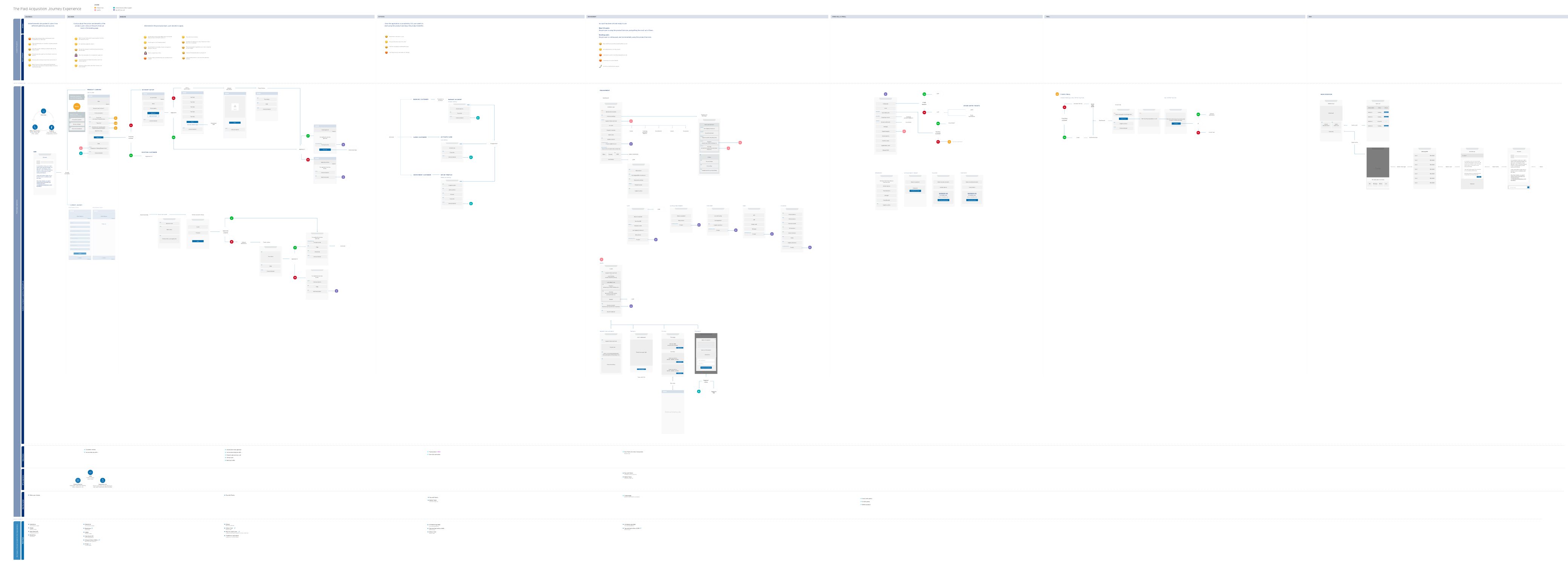
This was able to give us an overview of when and where servicing is required, in what kind of format help should be provided as well as helping us plan out the roadmap towards the vision.

Servicing is part of a client's journey with the bank from start to end, and hence it overlaps with the overall client journey. In a nutshell, we will have short-term turnarounds, mid-term MVP & enhancements and long term integration. This helps us to define and plan out the subsequent projects, also to keep us on track with the different features priorities.
HK · In use
SG, TW · In production
UX & UI
As one of the short-term turnarounds, live chat feature was redesigned and rebranded primarily for our clients in Hong Kong, enabling a familiar and easy to use mobile solution for wealth clients on-the-go, or those who'd like to monitor or enquire their investment performance at their own conveniences.
As the name suggests, Live Chat allows the clients having real time conversations with their relationship managers on the go. Main features in this project includes text messages, voice and video calls, screensharing capabilities, and the product scope includes both the mobile phone and desktop platforms.
The general feedback from real Hong Kong users are positive, they think the solution is convenient, easy to use and reduces a lot of the time in commute. Most of the parts to improve on has to do with internet stability and service calls and connections, something that we are aiming to improve on.
HK · In production
UX & UI
Also piloting for Hong Kong market, this minimal viable product went through more rounds of explorations and research. Considered as a mid-term MVP and potentially feature to be enhanced, this project will also be included as part of the long-term integration for all servicing touchpoints and experiences.
Relationship Managers are busy, so as the customers. By introducing an appointment booking feature to the system, our client is able to book a preferred timeslot to meet up or have an online discussion with their RMs.

Not only is the online experience, but also the offline meet up experience is also considered as part of this project. The service provided from the bank to the clients' side should be holistic and professional in general.
AU · In production
Mainly UX
Another mid-term MVP project that helps us pave the way to our long-term servicing solution. This is a white-label project with various version of proposals, user journeys and scenarios.
Bank services should not work in silos, so are bank products. We aim to create the solution with a responsive framework such that the chat service could be unplugged annd plugged to a third party or white label company easily, and adapt to their respective branding languages.
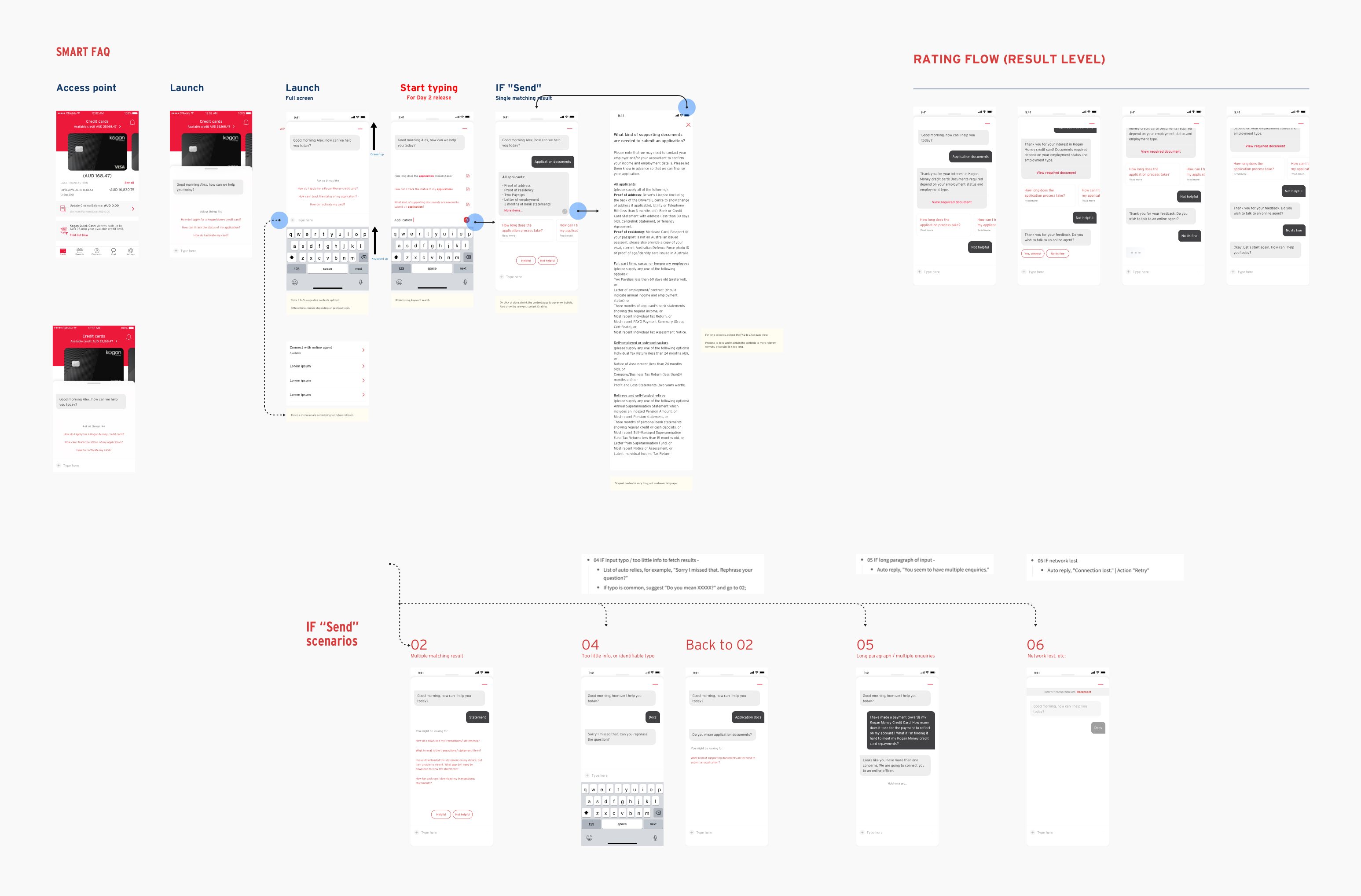
By designing the conversational experience in banking, we aim to not only create the product and features, but to design the entire service the bank has to offer to the clients.
Managing communications is such an important step in any companies that has more than one team. Having realistic delivery target, having efficient conversations with the respective parties and making sure to keep everyone in the picture is essential to create successful product and lift the stress off the designers. Among the teams within the same department, it is far more efficient if everyonne is aware of what each others are doing than duplicating the efforts.